Thursday 2 December 2010

Direct Mail


My direct mail is very similar to the one used for the restaurant Nandos. Basically every time you visit Yo! Sushi for some grub you will receive a stamp. By collecting these stamps you will receive free dishes at certain stages. The chosen free dish all depends on the colour you have reached. 

This loyalty card gives you something back in return for your loyal visits to Yo! Sushi. The card consists of two 85mm x 55mm panels side by side which will be folded once printed. The card will be printed back to back. The front and back pages deliver the aim behind the direct mail and the inside pages are where you will build up your stamp collection.

These cards will be given out at the main Yo! Sushi branch and will also be delivered through your letter box as a piece of direct mail.

Research into wine bottles and my designs


Here are a couple of wine bottles that I came across in my research. Both these designs are very unique and show that wine labels and be made to look fun and creative. I was drawn towards the bottle designs that were covered in illustrations, as that is the look i have chosen for my wall mural. On both bottles the illustrations wrap around them, I may take this into consideration when applying my illustrations.


My Wine Bottle Designs


First attempt of wine bottle designs


Top of the bottle lids


Tuesday 30 November 2010

YO! Sushi Menu


Rather than going for the standard A4 menu size, my menu consists of seven individual cards that will open out to make a fan like pattern. These will be secured to one another by a rivet like device in the top left hand corner of the menu.


Monday 8 November 2010

My Yo! Sushi interior


Here is a sneak preview to how the layout and colour scheme of my Yo! Sushi interior will be designed. My wall mural will stretch across the entire back wall, becoming the main focus in the room. Small individual parts of this mural will then break off, spreading around on to other walls in the restaurant.  To make up for the loss of colour in my wall mural the furniture will become vibrant and modern, adding to the playfulness of Yo! Sushi.

(colours on the bottom image are not for definate)

Thursday 21 October 2010

Wall Mural - First attempt


My wall mural is built up by the individual illustrations that i have designed. These have then been duplicated, creating a fun and eye catching pattern. I am pleased with the overall look and think that it would fit in well with the Yo! Sushi style with its uniqueness.


In my previous posts I have said that my mural will be vibrant in colour. This I think is going to change as the mural in black and white looks just as powerful as it would if in colour. I have tried out some of my illustrations in colour and think that it would make the mural look childish and to cluttered.

Below are some examples of my coloured illustrations.


Tuesday 19 October 2010

More of my illustrations

Since my last blog entry I have been developing ideas for my wall mural.


Big Ben
Just like the illustration I did for the London Eye, I have played on the the name of the London landmark called Big Ben. Straight away my first thoughts was to turn it into a character with power and strength. To show this I decided on adding a pair of muscle arms and a large, heavy chain around his neck. This all connects very well together and shows a sense of  power. I wouldn't mess around with Big Ben if i was you.


Tourist Camera
Tourists in London go photo crazy when sight seeing around the city. So i decided to play with this factor and make the camera home to a small, photo thirsty monster. This monster is hidden away inside the camera lens where you can just see it's wide eyes and razor sharp teeth. I then decided to give the illustration a pair of zombie like arms to go with the whole monster theme. I think this works really well and completes the illustration.


Theatre Masks
London is well known for its theatre plays down at the Westend. To show this i went straight for the traditional theatre masks, showing the emotions of happy and sad. I wanted to emphasis on these emotions, so made the facial features more distinctive. I then decided on  placing a tear drop underneath the eye of the sad mask to emphasis the emotion. This further developed into me giving the tear drop a character of its own, making it to have the sad emotion on its face. To balance the illustration out i then added a small sun underneath the eye of the happy mask to emphasis the emotion of happiness. 


With this illustration i was thinking of maybe adding two hands at either side of the masks. One giving the thumbs up and one giving the thumbs down. This is because i feel as though it is missing something compared to all the other illustrations i have done so far.


Telephone Box
 I wanted to step away from the tradional looking phone box, so decided on turning it into an alien like creature. To achieve this I turned the phones into tenticals and gave the design similair characteristics to some of my previous illustrations.


The Gherkin


London Underground


Thursday 7 October 2010

Yo! Sushi Interior

In March 2010, Yo! Sushi re-opened one of its outlets in London at the County Hall location, after undertaking a refurbishment. The outlet then became retro themed, following the colour scheme of oranges, browns and greens. These colours were then accompanied by large oversized lamp shades decorated with the patterns of Japanese trees and swirling motifs. This interior was designed by Philip Watts Design.


Knowing that Yo! Sushi already have a retro themed outlet, i now know not to go down that route and to use an alternate scheme. The scheme that i am aiming for is a funky, modernistic and vibrant outcome, which is totally the opposite to this one.

Yo! Sushi - Website

Screen Shots


Here are some screen shots of the Yo! Sushi website. Straight away we get the impression that they are going for a clean and new look. This is down to how tidy and well laid out the site is. The fact that they have used a san serif typeface adds to the modernist look, rather than a serif typeface.


On this screen shot of the website we can see how it says "How to Yo!". This stands out to me as they are trying to be quirky about the way they get their customers to try out their food, making it seem a more fun and exciting place to eat. Also on this screen shot we can see it explaining about the different cost of plates, which again is new and individual. 


The colour scheme of the website is mainly built up out of vibrant, eye catching colours. Some of these can be seen in the Yo! Sushi logo. Helping the Website and logo connect well together.

Yo! Sushi - Brand Report


Yo! Sushi’s attitude to design is seen by many as radical.  Instead of all their outlets being designed in the same corporate scheme, the company is rebelling, by designing each outlet in its own individual style.

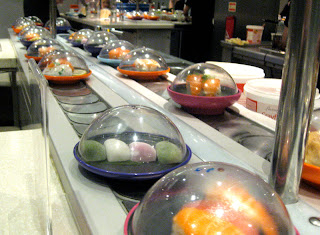
The company is unique in several ways, such as the way in which food is delivered to its customers on a moving conveyer belt.  The way the cost of the meal is calculated is also very different to other restaurants, where colour coded plates show the varying cost of the Sushi.

Yo! Sushi’s logo is vibrant, eye-catching and is clearly designed to attract a younger customer base.  The logo complements the fresh food and clean modern decoration.  

The city that I have chosen for my Yo! Sushi! Restaurant is London.  I have chosen London because it is the capital city and there are a large variety of iconic landmarks, such as The Houses of Parliament, Bucking Palace and The London Eye that could be incorporated into the design scheme.   I have chosen London as this will give me the most variety and creativity to play with considering the famous sights and the history behind them.  The cityscape of London is unmistakable and is recognised across the world. 

Jared Nickerson is the illustrator that I have gained my inspiration from for the style of my wall mural.  This is because his work has a fun, fresh vibe to it with his extremely imaginative thinking and unique character designs.  The aim of my mural is to include a range of London landmarks, but then for them to have its own quirky twist.  This updated cityscape will form the main section of the mural which will be used on promotional materials and menus.

The target audience mainly consists of 18-25 year olds and therefore I am going to design the interior in a funky, modern and vibrant scheme.  The aim of the design is to make Yo! Sushi! a memorable place to eat, where you can enjoy fresh, tasty food in a very modern and well styled surroundings.

Monday 4 October 2010

Yo! Sushi - In General

After jumping straight into the illustration style and city choice, lets look at the Yo! Sushi brand in detail.

The Yo! Sushi brand are very radical with their designs. Instead of having a corporate interior for each restaurant, such as Mcdonalds. They are wanting each one to have its own individual style/theme. The company its self is unique in several ways, such as the way in which food is delivered to its customers on a moving conveyer belt. The way the cost of the meal is calculated is also very different to other restaurants, where colour coded plates indicate the varying cost of the sushi.


Yo! Sushi's logo is vibrant, eye catching and is clearly designed to attract a younger customer base (18 - 25 year olds). The logo complements the fresh food and clean modern decoration, with its clean typography and vibrant colour scheme. 


Further on in my blog i will be looking at the Yo! Sushi website and existing interior designs.

Wednesday 29 September 2010

My Illustration - London Eye

After the process of constant rough sketches and designing on Illustrator i have created my first illustration (uncompleted). Playing on the name "The London Eye" i have made the main focus of the illustration be revolved around eye balls. 


To make the illustration feel more quirky, i decided on giving the character a pair of sneakers. This should hopefully help it appeal more to the target audience, 18 - 25 year olds.


Following the fun and random illustration work of Jared Nickerson. I feel as though this style of illustration is defiantly the right route.  It also gives me the opportunity to be extremely creative and imaginative with my ideas and thoughts.

Chosen City


London is the city that i have chosen for my Yo! Sushi restaurant to be situated. I was very close to doing New York or Paris, but decided on staying British and doing the capital city. 

These are a few "top of the mind" branding examples for my chosen city.

  • London Eye
  • Big Ben
  • Houses of Parliament
  • The Gherkin
  • Red buses/phones
  • Tower of London
  • The Queens Jewels
  • London Underground
  • Buckingham Palace
  • Fire of London


Now that i have decided on the illustration style and city my Yo! Sushi will be situated. 


Time to get designing!


Jared Nickerson - My chosen Illustration style

 CHECK THIS OUT :)


Flicking through The Computer Arts magazine i came across an Illustrator named Jared Nickerson. The quirky sense of humour and unique characteristics of his work caught my eye instantly, giving me the inspiration in which i was looking for. 


I love the way in which he picks out everyday objects and creates them into a character, giving it humour and expression.


I think that this style of illustration would work great along side the identity of Yo! Sushi, as its playful, young and fresh. The typography in his work could also be used on my wall mural, as it connects well with the styling of the Yo! Sushi logo. 


Although i like the black and white version of his illustrative work, i think that the vibrant colours used in the piece above would best suite the Yo! Sushi brand and its target audience.


CHECK MORE OUT :)


Jared Nickerson is not a one trick pony. His illustration work varies in style and detail. Below is an example of how detailed his illustration work can be.

His work can be seen on  www.behance.net/j3concepts 


Jared Nickerson also mixes typography with his illustrations. With the typography below he has took the illustrative pattern used on the previous image and then filled the typography in with it, making it connect nicely with the illustration. 


After viewing this typography it has given me the idea of having my type for "Yo! Sushi London " to have the illustrative background of my wall mural as its filling. This will then connect the extended logo and mural together.


Monday 27 September 2010

Illustrators

I have began researching into certain Illustrators, who's work i find eye catching and inspirational. Looking at each ones own individual and unique style i hope to gain some thoughts and ideas on how to design my wall mural for Yo! Sushi. 

Jon Burgerman


Good wives and warriors


These are just a few of the illustrators i have looked at so far. If you know of any others that i may like please leave a comment.