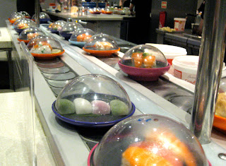
The Yo! Sushi brand are very radical with their designs. Instead of having a corporate interior for each restaurant, such as Mcdonalds. They are wanting each one to have its own individual style/theme. The company its self is unique in several ways, such as the way in which food is delivered to its customers on a moving conveyer belt. The way the cost of the meal is calculated is also very different to other restaurants, where colour coded plates indicate the varying cost of the sushi.
Yo! Sushi's logo is vibrant, eye catching and is clearly designed to attract a younger customer base (18 - 25 year olds). The logo complements the fresh food and clean modern decoration, with its clean typography and vibrant colour scheme.

Further on in my blog i will be looking at the Yo! Sushi website and existing interior designs.
No comments:
Post a Comment